Flexbox(フレックスボックス)とは、「Flexible Box Layout Module」の略で、Webコンテンツを適切に配置できる機能で、CSSでレイアウトを組む上での基本になります。
Flexboxの基本
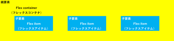
Flexbox」の基本的な書き方は、「フレックスコンテナ」と呼ばれる親要素の中に「フレックスアイテム」と呼ばれる子要素を入れてHTMLを作成します。
そして、様々なプロパティを使用して子要素のアイテムを自由に並び替えます。今回は、配置を決めるプロパティ、5種類を紹介します。
| プロパティ | 説 明 |
| flex-directionプロパティ | 子要素の並ぶ向きを指定します。 |
| flex-wrapプロパティ | 子要素を折り返を指定します。 |
| justify-contentプロパティ | 子要素の水平配置を指定します。 |
| align-itemsプロパティ | 子要素の垂直配置を指定します。 |
| align-contentプロパティ | 子要素が複数行に渡る場合の垂直配置を指定します。 |
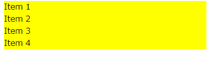
まずは、HTMLは親要素である「container」というクラスのついた <div>タグの中に、子要素の「item」というクラスのついた <div>タグを作ります。
<HTML>
<div class="container">
    <div class="item">Item 1</div>
    <div class="item">Item 2</div>
    <div class="item">Item 3</div>
    <div class="item">Item 4</div>
</div>
次に、CSSで「container」のサイズを指定します。(今回は分かりやすいように背景色を黄色にします)
<CSS>
.container {
    width: 600px;
    background: yellow;
}
<ブラウザ表示>
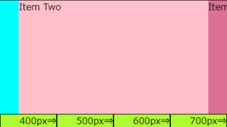
この段階では、400px(幅)の「フレックスコンテナ」の中に「Item」が5つ並んでいます。実際には「Item]の中に様々なコンテンツを入れ込むので、最低でも余白の指定は欲しいものです。
CSSで「Irem]の余白を指定します。(今回は分かりやすいように背景色を青色にします)
<CSS>
.item {
    background: blue;
    color: white;
    margin: 10px;
    padding: 10px;
}
<ブラウザ表示>
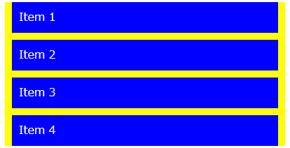
このように、「Item](余白のついた文字)が縦に並びましたが、このままではレイアウトを変更することはできません。
親要素に「display: frex;」を追記すると、追加のプロパティで子要素の並びをカスタマイズできます。
<CSS>
.container {
    display: flex;
}
<ブラウザ表示>

子要素の並ぶ向きを指定する「flex-directionプロパティ」
「flex-directionプロパティ」は、上下左右のどこから配置するのか指定することができます。
| flex-direction プロパティで使用できる値 | ||
| 値 | 記述 | 説明 |
|---|---|---|
| row(デフォルト) | flex-direction: row; | 子要素を左から右に配置 |
| row-reverse | flex-direction: row-reverse; | 子要素を右から左に配置 |
| column | flex-direction: column; | 子要素を上から下に配置 |
| column-reverse | flex-direction: column-reverse; | 子要素を下から上に配置 |
それぞれの値によるブラウザ表示
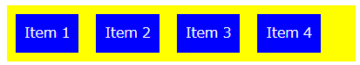
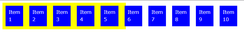
row(子要素を左から右に配)デフォルト
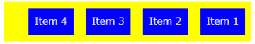
row-reverse(子要素を右から左に配置)
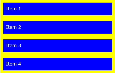
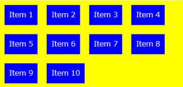
column(上から下に並ぶ)
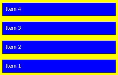
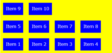
column-reverse(下から上に並ぶ)
◎row-reverse を使った記述例
<CSS>
.container {
    width: 600px;
    background: yellow;
    display: flex;
    flex-direction: row-reverse;
}
.item {
    background: blue;
    color: white;
    margin: 10px;
    padding: 10px;
}
子要素を折り返を指定する「flex-wrapプロパティ」
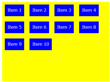
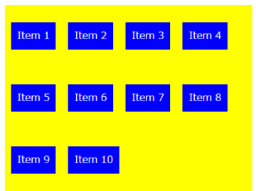
「flex-wrapプロパティ」は、子要素が親要素の幅を超えた場合に複数行に並べるように指定します。複数行を指定しない場合、子要素が親要素の幅を超えると↓↓のような表示になります。(分かりやすいように、HTMLの「Item」の数を増やしています)
| flex-wrap プロパティで使用できる値 | ||
| 値 | 記述 | 説明 |
|---|---|---|
| nowrap(デフォルト) | flex-wrap: nowrap; | 子要素を折り返さずに1行に配置 |
| wrap | flex-wrap: wrap; | 子要素を折り返し、複数行に上から下に配置 |
| wrap-reverse | flex-wrap: wrap-reverse; | 子要素を折り返し、複数行に下から上に配置 |
それぞれの値によるブラウザ表示
wrap
(子要素を折り返し、複数行に上から下に配置)
wrap-reverse
(子要素を折り返し、複数行に下から上に配置)
◎wrap を使った記述例
<HTML>「Item」の数を増やしています。
<div class="container">
    <div class="item">Item 1</div>
    <div class="item">Item 2</div>
    <div class="item">Item 3</div>
    <div class="item">Item 4</div>
    <div class="item">Item 5</div>
    <div class="item">Item 6</div>
    <div class="item">Item 7</div>
    <div class="item">Item 8</div>
    <div class="item">Item 9</div>
    <div class="item">Item 10</div>
</div>
<CSS>
.container {
    width: 400px;
    background: yellow;
    display: flex;
    flex-wrap: wrap;
}
.item {
    background: blue;
    color: white;
    margin: 10px;
    padding: 10px;
}
子要素の水平配置を指定する「justify-contentプロパティ」
「justify-contentプロパティ」は、親要素に空きスペースがある場合に、子要素を水平方向のどの位置に配置するかを指定します。
| justify-content プロパティで使用できる値 | ||
| 値 | 記述 | 説明 |
|---|---|---|
| flex-start(デフォルト) | justify-content: flex-start; | 子要素を左揃えに配置 |
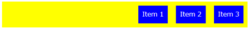
| flex-end | justify-content: flex-end; | 小要素を右揃えに配置 |
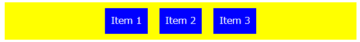
| center | justify-content: center; | 小要素を中央揃えに配置 |
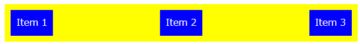
| space-between | justify-content: space-between; | 最初と最後の小要素を両端、残りの小要素は均等に配置 |
| space-around | justify-content: space-around; | すべての子要素を均等に配置 |
それぞれの値によるブラウザ表示
flex-end(右揃)
center(中央揃え)
space-between(両端と均等配置)
space-around(均等配置)
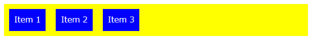
◎center を使った記述例
<HTML>「Item」の数を3つにしました。
<div class="container">
    <div class="item">Item 1</div>
    <div class="item">Item 2</div>
    <div class="item">Item 3</div>
</div>
<CSS>
.container {
    width: 600px;
    background: yellow;
    display: flex;
    justify-content: center;
}
.item {
    background:
    blue; color:
    white; margin: 10px;
    padding: 10px;
}
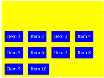
子要素の垂直配置を指定する「align-itemsプロパティ」
「align-itemsプロパティ」は、親要素に空きスペースがある場合に、子要素を垂直方向のどの位置に配置するかを指定します。
| align-items プロパティで使用できる値 | ||
| 値 | 記述 | 説明 |
|---|---|---|
| stretch(デフォルト) | align-items: stretch; | 親要素の高さ、またはコンテンツの一番多い子要素の高さに合わせて広げて配置 |
| flex-start | align-items: flex-start; | 親要素の開始位置から、上揃えに配置 |
| flex-end | align-items: flex-end; | 親要素の終点位置から、下揃えに配置 |
| center | align-items: center; | 中央揃え |
| baseline | align-items: baseline; | ベースラインで揃える |
それぞれの値によるブラウザ表示
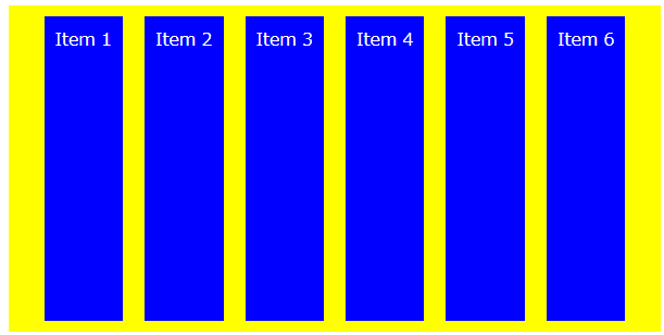
分かりやすいように、「container」に300pxの高さを与え、「Item]の数を6つにしています。
flex-start(上揃え配置)
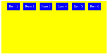
flex-end(下揃え配置)
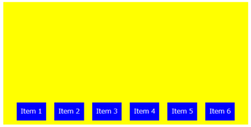
center(中央揃え)
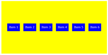
baseline(ベースライン揃え)
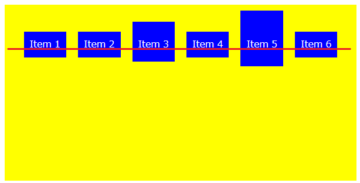
◎center を使った記述例
<div class="container">
    <div class="item">Item 1</div>
    <div class="item">Item 2</div>
    <div class="item">Item 3</div>
    <div class="item">Item 4</div>
    <div class="item">Item 5</div>
    <div class="item">Item 6</div>
</div>
.container {
    width: 600px;
    height: 300px;
    background: yellow;
    display: flex;
    align-items: center;
}
.item {
    background: blue;
    color: white;
    margin: 10px;
    padding: 10px;
}
子要素が複数行に渡る場合の垂直配置を指定する「align-contentプロパティ」
「align-contentプロパティ」は、子要素が複数行にわたった場合の垂直方向の配置を指定します。「flex-wrap: nowrap;」が適用されている場合、子要素が1行になるので「align-contentプロパティ」が無効になります。
「flex-wrapプロパティ」のデフォルトの値は「nowrap」なので、「wrap」または「wrap-revers」と併用しましょう。
| align-content プロパティで使用できる値 | ||
| 値 | 記述 | 説明 |
|---|---|---|
| stretch(デフォルト) | align-content: stretch; | 要素の高さに合わせて、広げて均等に配置 |
| flex-start | align-content: flex-start; | 要素の開始位置から、上揃えに配置 |
| flex-end | align-content: flex-end; | 要素の終点位置から、下揃えに配置 |
| center | align-content: center; | 中央揃え |
| space-between | align-content: space-between; | 最初と最後の子要素を上下の端に配置し、残りの子要素は均等に配置 |
| space-around | align-content: space-around; | すべての子要素を均等に配置 |
それぞれの値によるブラウザ表示
stretch(高さを広げて均等配置)デフォルト
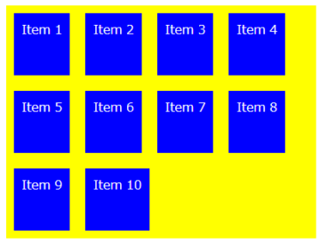
flex-start(上揃え配置)
flex-end(下揃え配置)
center(中央揃え)
space-between(上下端と均等配置)
space-around(均等配置)
◎space-around を使った記述例
<HTML>「Item」の数を10にしました。
<div class="container">
    <div class="item">Item 1</div>
    <div class="item">Item 2</div>
    <div class="item">Item 3</div>
    <div class="item">Item 4</div>
    <div class="item">Item 5</div>
    <div class="item">Item 6</div>
    <div class="item">Item 7</div>
    <div class="item">Item 8</div>
    <div class="item">Item 9</div>
    <div class="item">Item 10</div>
</div>
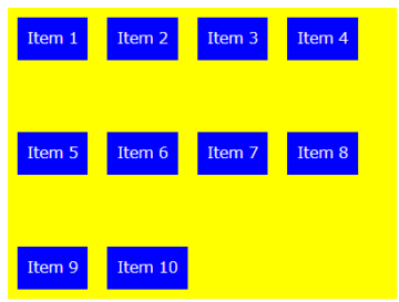
<CSS>「flex-wrap: wrap」で折り返したボックスを「align-content: space-around; 」で均等に配置。
.container {
    width: 400px;
    height: 300px;
    background: yellow;
    display: flex;
    flex-wrap: wrap;
    align-content: space-around;
}
.item {
    background: blue;
    color: white;
    margin: 10px;
    padding: 10px;
}
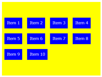
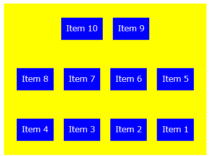
複数のプロパティを組み合わせる
複数行に渡る場合の垂直配置を指定すのに、「align-contentプロパティ」と「flex-wrapプロパティ」を組み合わせて使いましたが、その他にも組み合わせて使うことができます。
◎複数のプロパティを組み合わせた記述例
<HTML>
<div class="container">
    <div class="item">Item 1</div>
    <div class="item">Item 2</div>
    <div class="item">Item 3</div>
    <div class="item">Item 4</div>
    <div class="item">Item 5</div>
    <div class="item">Item 6</div>
    <div class="item">Item 7</div>
    <div class="item">Item 8</div>
    <div class="item">Item 9</div>
    <div class="item">Item 10</div>
</div>
<CSS>
.container {
    width: 400px;
    height: 300px;
    background: yellow;
    display: flex;
    flex-direction: row-reverse;
    flex-wrap: wrap-reverse;
    justify-content: center;
    align-content: space-around;
}
.item {
    background: blue;
    color: white;
    margin: 10px;
    padding: 10px;
}
<ブラウザ表示>
フレックスコンテナ内に配置するフレックスアイテムの幅を調整する「frexプロパティ」は↓↓で紹介しています。