前回の記事では Frexbox の機能を用いてフレックスコンテナにフレックスアイテムを配置する方法を紹介しました。

今回は、フレックスコンテナ内に配置するフレックスアイテムの幅を調整する「frexプロパティ」を紹介します。
| プロパティ | 説 明 |
|---|---|
| flexプロパティ | フレックスアイテムの幅をまとめて指定するショートハンドです。 |
| flex-growプロパティ | フレックスコンテナの主軸の幅に余白がある場合の、フレックスアイテムの伸び率を指定します。 |
| frex-shrinkプロパティ | すべてのフレックスアイテムの幅の合計がフレックスコンテナの主軸の幅よりも大きい場合の、フレックスアイテムの縮み率を指定します。 |
| frex-basisプロパティ | フレックスアイテムの基本の幅を指定します。 |
解説資料
<サンプルHTML>
<div class="container">
    <div class="item item1">Item One</div>
    <div class="item item2">Item Two</div>
    <div class="item item3">Item Three</div>
</div>
 <!--測定用ルーラー(参考)-->
<div class="measure">
    <div>100px⇒</div>
    <div>200px⇒</div>
    <div>300px⇒</div>
    <div>400px⇒</div>
    <div>500px⇒</div>
    <div>600px⇒</div>
    <div>700px⇒</div>
    <div>800px⇒</div>
    <div>900px⇒</div>
    <div>1000p⇒</div>
</div>
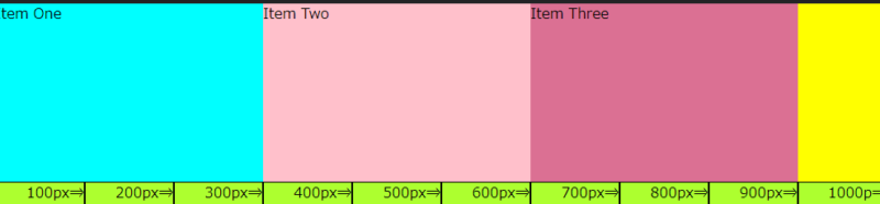
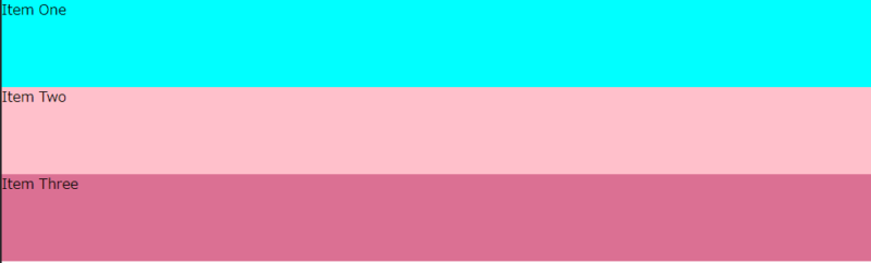
container の中に 「Item One」「Item Two」「Item Three」というフレックスアイテムを作りました。
※測定用ルーラーは、アイテムの幅の変化を目視できるように100pxの幅の表示を横並びにしたもので、目安です。
<サンプルCSS>
.container {
    width:1000px;
    background-color: yellow;
    display: flex;
}
.item {
    height: 200px;
}
.item1 {
    background-color: aqua;
}
.item2 {
    background-color: pink;
}
.item3 {
    background-color: palevioletred;
}

/* 測定用ルーラー(参考)*/
.measure {
    width: 1000px;
    display: flex;
}
.measure div {
    width: 100px;
    margin: 0px;
    border: solid 1px;
    background-color: greenyellow;
    text-align: end;
}
container の幅を1,000px、item の高さを200pxに設定し、それぞれに異なる色を配色しました。
<ブラウザ表示>
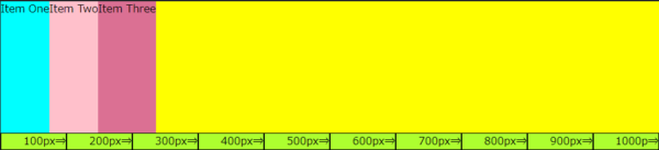
「Item One」「Item Two」「Item Three」のアイテムと、黄色に表示されている「container」の余白分の合計幅が1,000pxです。
これを基に、「frexプロパティ」でアイテムの幅を変えていきます。
frexプロパティ
「frexプロパティ」はフレックスアイテムの幅をまとめて指定するショートハンドで、「flex-grow」「frex-shrink」「frex-basis」のプロパティを一括指定します。
| flex プロパティで使用できる値 | ||
| 値 | 記述 | 「flex-grow」「frex-shrink」「frex-basis」の値 |
|---|---|---|
| initial | flex: initial; | 0 1 auto |
| auto | flex: auto; | 1 1 auto |
| none | flex: none; | 0 0 auto |
| 数値 | flex: (任意の数値); | ※値が1つの場合、2つの場合、3つの場合がある |
数値による値
<HTML>
<div class="container">
    <div class="item item1">Item One</div>
    <div class="item item2">Item Two</div>
    <div class="item item3">Item Three</div>
</div>
<CSS>
.item1 {
background-color: aqua;
    flex: 1;
}
.item2 {
background-color: pink;
    flex: 1;
}
.item3 {
background-color: palevioletred;
    flex: 1;
}
<ブラウザ表示>

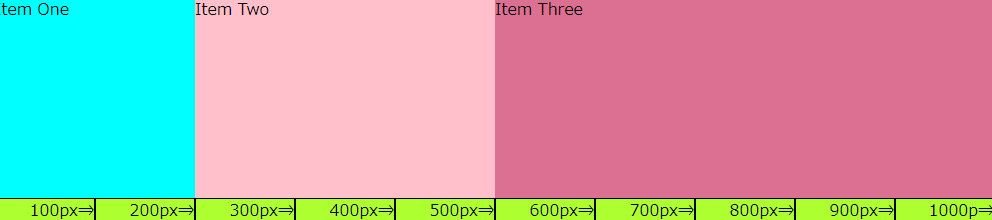
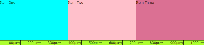
「Item One」「Item Two」「Item Three」という3つのフレックスアイテムに、「flex:1;」を指定することで、それぞれのアイテムを「1:1:1」の幅になります。全体の幅が1,000pxなので、1つのフレックスアイテムの幅が333.33・・・pxになりました。
この時の「flex-grow」「frex-shrink」「frex-basis」のプロパティの値は↓↓のように一括指定(ショートハンド)されています。
flex-grow: 1;
flex-shrink: 1;
flex-basis: 0%;
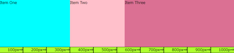
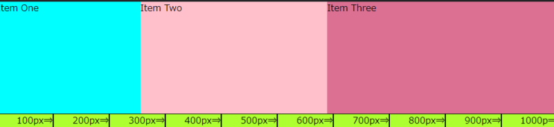
これを「Item One」に「 flex: 2;」、「Item Two」に「 flex: 3;」「Item Three」に「 flex: 5;」と値を変更すると、「2:3:5」の表示になります。
<CSS>
.item1 {
    background-color: aqua;
    flex: 2;
}
.item2 {
    background-color: pink;
    flex: 3;
}
.item3 {
    background-color: palevioletred;
    flex: 5;
}
<ブラウザ表示>
※1つのフレックスアイテムだけに「flex:1;」を指定すると、指定したフレックスアイテムだけが余白を無くすように広がります。
「widthプロパティ」でアイテムの幅を指定
アイテムボックスは「widthプロパティ」を使って幅を指定することもできます。
<CSS>すべてのフレックスアイテムを width で幅を指定
.item1 {
    background-color: aqua;
    width: 30%;
}
.item2 {
    background-color: pink;
    width: 300px;
}
.item3 {
    background-color: palevioletred;
    width: 300px;
}
<ブラウザ表示>

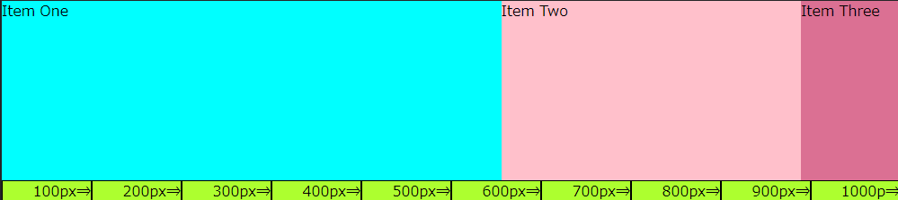
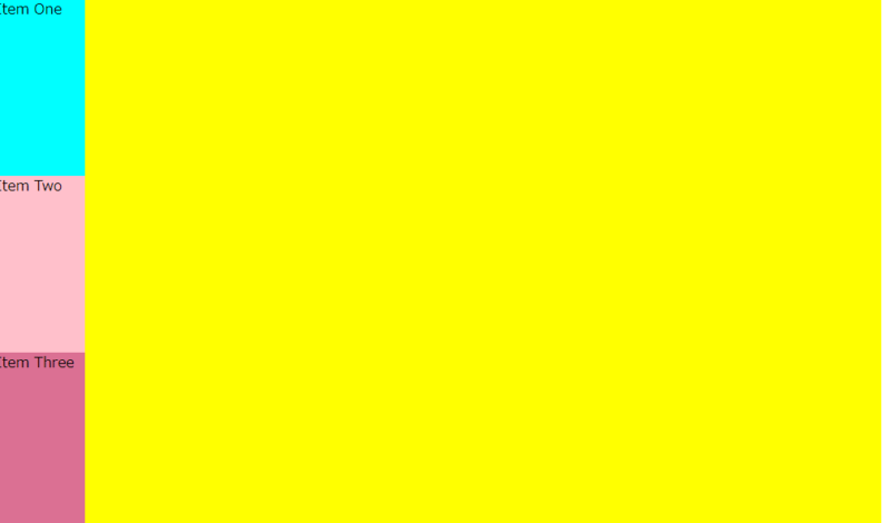
- 「Item One」は1,000pxの30%なので300px
- 「Item Two」と「Item Three」は300px
- コンテナボックスの幅からフレックスアイテムの幅を差し引いた100pxの余白がのこります
<CSS>1つのフレックスアイテムを width で幅を指定した場合
.item1 {
    background-color: aqua;
    width: 300px;
}
.item2 {
    background-color: pink;
    flex: 2;
}
.item3 {
    background-color: palevioletred;
    flex: 4;
}
<ブラウザ表示>
「Item Two」と「Item Three」は「Item One」の固定値を差し引いた、残りの700pxを「2:4」の割合で幅が指定されます。
- 「Item One」: width で300pxの幅に固定
- 「Item Two」:(1000-300)×2/6≒233.33px
- 「Item Three」:1000-300)×4/6≒466.66px
flex-growプロパティ
フレックスコンテナの主軸の幅に余白がある場合の、フレックスアイテムの伸び率を指定します。値は正の数値(初期値は0)を用いて指定します。
指定する数値は、フレックスコンテナ内におけるフレックスアイテムの比率になります。
<CSS>
.item1 {
    background-color: aqua;
    flex-grow: 2;
}
.item2 {
    background-color: pink;
    flex-grow: 3;
}
.item3 {
    background-color: palevioletred;
    flex-grow: 4;
}
<ブラウザ表示>
ここで注目して頂きたいのは、flex と flex-grow では「2:3:4」に指定しても表示が異なることです。
flex で「2:3:4」と指定した場合:200px:300px:400pxになるのに対して、flrex-grow で「2:3:4」と指定した場合は、約243.72px:328.88px:427.41pxと表示になります。
このような表示になるのは、フレックスアイテムの中にあるコンテンツの幅(最小単位)を、フレックスコンテナ(全体幅)から指しい引いた幅を「2:3:4」の割合にするのがflex-growだからです。
分かりやすいようにフレックスアイテムの最小幅を100pxとして、「2:3:4」の比率を指定してみます。
<CSS>
.item1 {
    background-color: aqua;
    width: 100px;
    flex-grow: 2;
}
.item2 {
    background-color: pink;
    width: 100px;
    flex-grow: 3;
}
.item3 {
    background-color: palevioletred;
    width: 100px;
    flex-grow: 4;
}
<ブラウザ表示>
- 「Item One」:100+(1,000-300)×2/9≒255.56px
- 「Item Two」:100+(1000-300)×3/9≒333.33px
- 「Item Three」:100+(1000-300)×4/9≒411.11px
flex-shrinkプロパティ
すべてのフレックスアイテムの幅の合計がフレックスコンテナの主軸の幅よりも大きい場合の、フレックスアイテムの縮み率を指定します。値は正の数値(初期値は1)を用いて指定します。
flex-wrapプロパティの値がno-wrapのときに意味を持ち、flex-basisプロパティの値が0のときには意味を持ちません。
例)フレックスアイテムを1,000pxに指定した上で、flex-shrink プロパティで「2:3:4」と指定してみます。
<CSS>
.item1 {
    background-color: aqua;
    width: 1000px;
    flex-shrink: 2;
}
.item2 {
    background-color: pink;
    width: 1000px;
    flex-shrink: 3;
}
.item3 {
    background-color: palevioletred;
    width: 1000px;
    flex-shrink: 4;
}
<ブラウザー表示>
flex-shrink プロパティで「2:3:4」の比率で指定すると、数値の小さい方が小さく表示され数値の大きい方が小さく表示されます。これは、フレックスアイテムの幅がフレックスコンテナの幅をオーバーした分を「2:3:4」の割合で縮めているからです。
この場合、コンテナ幅1,000pxに対してアイテム幅の合計を3,000pxとしたことで、2,000pxオーバーしています。そして、オーバーした2,000pxを「2:3:4」の比率でアイテム幅を縮めているのです。
- 「Item One」:1,000-(3,000-1,000)×2/9≒555.56px
- 「Item Two」:1,000-(3,000-1,000)×3/9≒333.33px
- 「Item Three」:1,000-(3,000-1,000)×4/9≒111.11px
flex-basisプロパティ
フレックスアイテムの基本の幅を指定するプロパティで width と大きな違いはありません。
値の初期値は「auto」で、数値に「px」や「%」の単位を付けて指定します。
<CSS>
.item1 {
    background-color: aqua;
    flex-basis: 30%;
}
.item2 {
    background-color: pink;
    flex-basis: 300px;
}
.item3 {
    background-color: palevioletred;
    flex-basis: 300px;
}
<ブラウザ表示>
前述の、「widthプロパティ」でアイテムの幅を指定した場合と同じ表示になります。
これに frex-grow で「1:1:1」の比率を指定すると、それぞれのアイテムが均等の幅になります。
<CSS>
.item1 {
    background-color: aqua;
    flex-basis: 30%;
    flex-grow: 1;
}
.item2 {
    background-color: pink;
    flex-basis: 300px;
    flex-grow: 1;
}
.item3 {
    background-color: palevioletred;
    flex-basis: 300px;
    flex-grow: 1;
}
<ブラウザ表示>
「widthプロパティ」と「flex-basisプロパティ」の違い
width は純粋に要素の横幅を指定するプロパティであるのに対し、flex-basis はフレックスアイテム(display:flexで横並びになった要素)の主軸方向における長さを指定するプロパティです。
そのため、flex-directionプロパティ(前回の記事で解説)で、主軸を上から下に変更すると、フレックスアイテムの高さを指定したことになります。
<HTML>今までと同じHTMLファイルを使用します。
<div class="container">
    <div class="item item1">Item One</div>
    <div class="item item2">Item Two</div>
    <div class="item item3">Item Three</div>
</div>
<CSS>主軸を上から下に指定した上に、flex-basis で高さ(従来は幅)を100pxに指定。
.container {
    width:1000px;
    background-color: yellow;
    display: flex;
    flex-direction: column
}
.item1 {
    background-color: aqua;
    flex-basis: 100px;
}
.item2 {
    background-color: pink;
    flex-basis: 100px;
}
.item3 {
    background-color: palevioletred;
    flex-basis: 100px;
}
<ブラウザ表示>
高さが100pxのフレックスアイテムが縦並びになりました。
<CSS>主軸を上から下に指定した上に、width で幅を100pxに指定。
.container {
    width:1000px;
    background-color: yellow;
    display: flex;
    flex-direction: column
}
.item {
    height: 200px;
}
.item1 {
    background-color: aqua;
    width: 100px;
}
.item2 {
    background-color: pink;
    width: 100px;
}
.item3 {
    background-color: palevioletred;
    width: 100px;
}
<ブラウザ表示>
width はあくまで幅を指定するプロパティなので、フレックスアイテムの幅が200pxで表示されます。
まとめ
- flexプロパティは、フレックスアイテムの幅をまとめて指定するショートハンドで flex-grow 、frex-shrink , frex-basis を一括指定できます。
- flex-growプロパティは、フレックスコンテナの主軸の幅に余白がある場合の、フレックスアイテムの伸び率を指定するもので、指定した数値の比率でフレックスアイテムの幅を広げます。
- frex-shrinkプロパティは、フレックスアイテムの幅の合計がフレックスコンテナの主軸の幅よりも大きい場合の、フレックスアイテムの縮み率を指定するもので、指定した数値の比率でフレックスアイテムの幅を縮めます。
- frex-basisプロパティは、フレックスアイテムの基本の幅を指定するもので、幅の指定においては width と同じですが、主軸を縦に変更した場合はフレックスアイテムの高さ指定になります。